How To Read a Chart

Something happens once you spend enough time looking at charts, working to influence them and trying (sometimes in futility) to explain their gyrations – you start to recognize patterns.
Recognizing patterns is an extremely important meta-skill as a marketer. It allows you to quickly diagnose a situation and increases your chances of making the right decision.
Traders have known this for decades. Technical analysis of stock charts is an age- old practice. I was surprised when I realized that I've never seen anyone apply the same thinking outside of finance.
So let's get into it. What are chart patterns you'll see regularly as a marketer, and what should you do when you see them?
Here are the patterns we'll cover in this post:
- Repeating waves
- Flat
- Vertical crash
- Sharp incline
- Sharp decline
- Steady decline
- Steady incline
1. Repeating Waves
When you hear someone blaming (or praising) seasonality, they're usually referring to a chart that has a repeating waves pattern. Some macro factor – likely far outside of your team's control – is influencing the chart.
Here's an example:
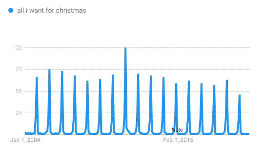
What could cause this pattern?
Holidays, summer vacation (especially in Europe!), disruptive weather patterns that may affect your target audience (forest fire season in California, hurricane/typhoon season, etc).
Moves by industry-leading companies can also cause a pattern like this. Ecommerce platforms in SEA run monthly sales. Alibaba has singles day. Amazon has Prime Day. Apple typically announces products in September.
What should you do?
Don't fight it and roll with the punches. Take advantage when it's in your favor and don't bother swimming against the tide when it's not. During "low tide" your effort is likely better spent on increasing efficiency instead of the Sisyphean task of driving acquisition.
Most importantly, since it's repeating – you can anticipate this happening, so bake it into your plans and communicate to stakeholders ahead of time.
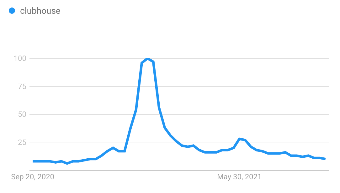
2. Flat
A stable chart with a horizontal slope.
An example:
What could cause this pattern?
I have three explanations for this chart.
In most cases, a chart like this depicts a state of equilibrium. It shows a system in balance; the first explanation is perhaps you've reached market saturation.
If the chart is not supposed to look this way because you're trying all sorts of stuff that should affect it, then either (a) your interventions are impotent because your understanding of the system is incorrect or (b) something is broken with your tracking or reporting – the chart shows the collective traffic from a campaign but you missed a UTM tag somewhere.
What should you do?
If you're expecting it to be flat, and you're okay with where it's at – keep an eye on it, but deprioritize taking any action. It's okay to do nothing if the numbers are within an acceptable range (eg: conversion rate, sales rep close rate).
However if it's flat despite interventions, then you have to take a hard look at your assumptions or and make sure you're not missing any data. You may also want to zoom out. You could also be looking at too close of a time period, and it's too soon to tell any impact (eg. you have a 6 month deal cycle but you're trying to measure the BOFU effect of your TOFU awareness campaigns)
3. Vertical Crash
Ah yes, everyone's nightmare. Something drops off a cliff:
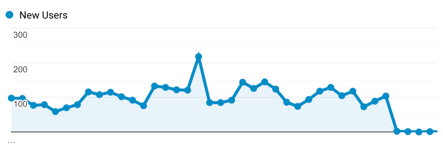
What could cause this pattern?
In the vast majority of cases, this is a technical issue. Something in the plumbing got screwed up. You forgot to add javascript tags when you redesigned your website that you relaunched. Your servers crashed. An API you rely on broke or you exceeded the rate limit, and you didn't know about it.
What should you do?
Depending on how mission critical it is, it might be time to wake up the on-call engineer. If customers are affected, you'll also want to start prepping your comms response. A cross-functional post-mortem (even a short one) should also take place.
4. Sharp Incline
Something unnatural (good or bad) is happening, causing a spike. Almost always followed by a decline of the same angle.
What could cause this pattern?
A massive rush of news coverage. You launched a SPIF for your reps to drive activity. You bought a bunch of Instagram followers. You hired a black hat SEO agency and they activated all their PBN backlinks in a short time period.
What should you do?
Don't get too excited or worried. Assume that things will likely come crashing back down just as quickly as they shot up. If the factors are external, then this is probably a tumultuous time, so if you're a leader – set expectations, mentally and emotionally prepare your team for the crash and plot out your next moves. Have a plan.
5. Sharp Decline
An unnatural shock to the system causes a metric to take a nosedive.
The chart will have a jagged way down (unlike vertical crash) indicating that it is highly unlikely to be caused by technical error. This is also not the inevitable crash after a sharp incline; this pattern is characterized by relative stability before the event.
The stock market crash of 2020 is a perfect example:
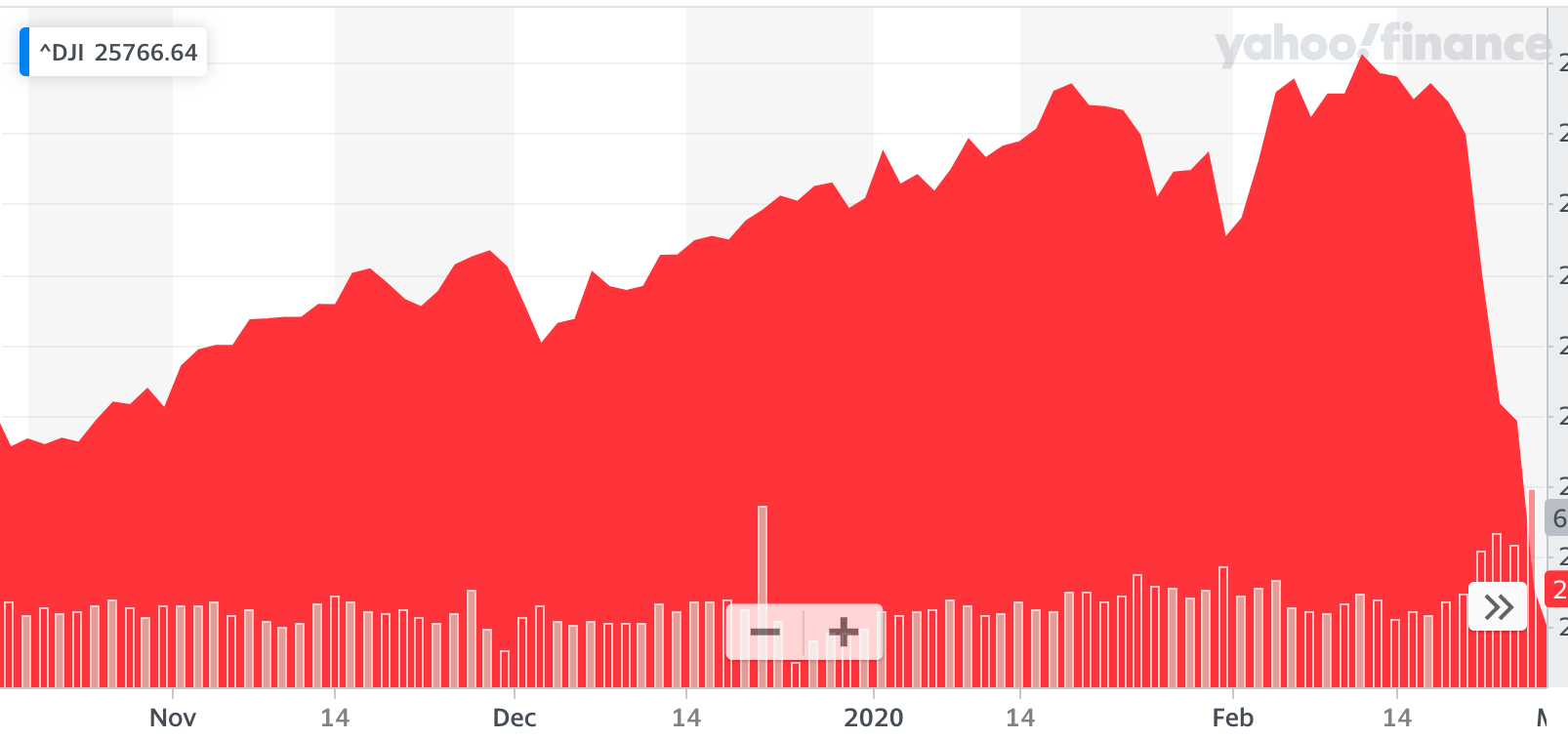
What could cause this pattern?
Volatility in a critical and significant factor. Game-changing terrible news. A major customer unexpectedly cancelled their contract and ceased payment. A manual penalty from Google.
What should you do?
Keep cool and don't panic. Check on your fundamentals to sanity check your ability to weather the storm. If your fundamentals were significantly compromised, then expect to make hard decisions like laying off staff or reconfiguring business lines. Diagnose the reasons and put yourself in a position to handle the volatility, then communicate the plan with your team.
6. Steady Decline
As a business leader or investor, this is perhaps the scariest chart of all.
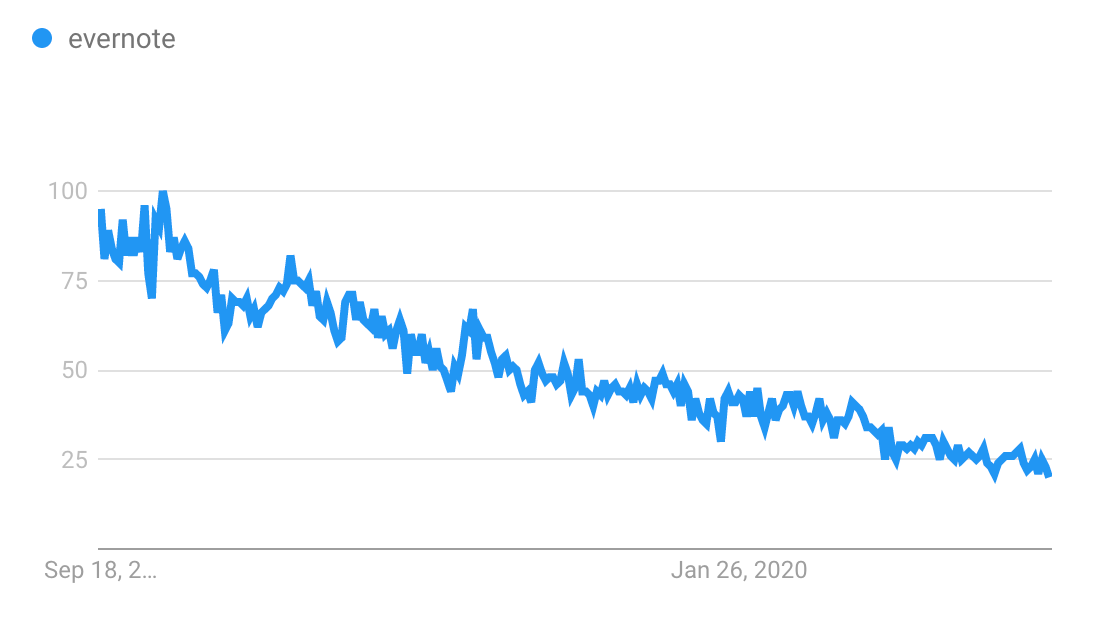
What could cause this pattern?
From a business lens, there's only one way to read this chart: management failure to grow.
You've lost your grip on product-market fit. You were on top of the world, but the world changed underneath your feet. Your product development process got too bloated and slow. You reached saturation in your initial market and you didn't figure out how to expand to an adjacent one. You changed your sales leader – and they had less discipline over sales activity, so bad habits snuck in and slowly degraded sales performance.
What should you do?
If you're in the thick of it, and it's a problem you want to solve, you have two choices.
One is to decide to make a drastic change immediately – layoffs, change the leadership team, give up and sell the company.
The other is you wait for the next "big thing" and bet on that wave.
On a small scale, this means replacing your sales manager, and when you hire a new one, giving them all the autonomy they need to succeed. This means updating your acquisition playbooks.
On a larger scale, this means conserving resources (austerity and layoffs?) and going back to fundamentals, simplifying product lines then waiting for the next paradigm shift.
This is exactly what Steve Jobs on his return to Apple in 1997.
7. Steady Incline
Let's end on a what is usually a happy chart pattern:
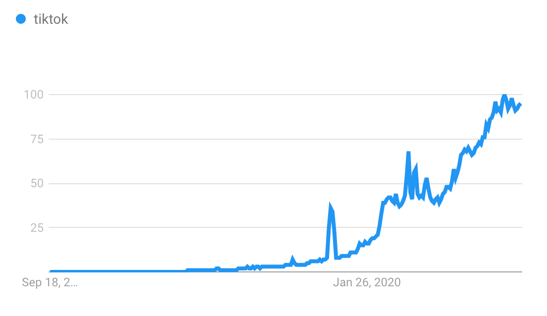
This one is different from Sharp Incline because of two reasons (1) the overall slope was already increasing and (2) it keeps going despite "heartbeat" type shocks.
What could cause this pattern?
Real traction, great word of mouth, expansion. Sustainable growth and scaling, strong fundamentals, product market fit.
What should you do?
Stay the course – what you're doing and the way you're doing them is working.
But recognize that growth gets harder as you go bigger, so you always have to find the next frontier. Is it a new channel? Horizontal or vertical product expansion? Engaging in M&A?
At a company level, ironically, this chart could also a trigger a discussion on whether you should cash your chips and sell the company, because suitors will come knocking. Sometimes companies realize that what's needed to keep growing is extremely daunting (could explain why Afterpay sold to Square.)
On a smaller scale, this means that you have strategy-tactic fit: your pricing strategy works, you've got the right channels, your SEO machine is humming along nicely.
Happy days, but be paranoid – good times don't last forever. If you want to keep it going, experiment to find the next S-curve.
This is not an exhaustive list of chart patterns you'll face, but this should cover the majority you'll run into. I hope to add to this over time. Let me know if there any patterns that I missed, or if you disagree with any of my interpretations above.